Tips on Organizing Fabric by Colour
It certainly does not take long for my fabric to get into total disarray. The colours are out of order, I can never find what I know that I have so that is when I know I must stop everything and organize my fabrics by colour to achieve sanity in my sewing area.
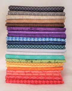
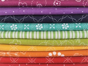
It’s nice to imagine your entire fabric stash folded flawlessly on shelves or uniformly stacked in colour order. But when stash fabrics come in different shapes and sizes, this vision can seem far-fetched. Some fabrics hold their lovely, folded shape when set aside, but there are those that seem to instantly expand, unroll, and topple over before your eyes. That’s why you’ll want to avoid limiting yourself to one organization method. Often, a variety of techniques are necessary to create the organization system of your dreams.
Here are some tips that may help you look at your fabrics in a new way. I know that they certainly helped me gain knowledge to build my own colour schemes for my sewing and quilting projects. Hopefully, they will help you as well.
Recognizing a Fabric’s Overall Colour
It is important to identify a fabric’s overall colour. This may seem somewhat straightforward, but it can be tricky. It will be really helpful later we organizing a stash by colour and creating colour schemes. And don’t forget, there is no right or wrong way of doing this. This is simply the way I tackle this!
First, lets examine the different types of fabrics.
Tone on Tone Fabrics
The term tone on tone refers to a printed fabric that is made by combining different shades and tones of the same colour.
Tone on tone fabrics often appear to be solid when viewed from a distance, but their printed motifs become recognizable on closer inspection.
These types of fabrics are great basics to start with when putting together a colour scheme. They’re often referred to as blenders, because they blend well with other types of fabric prints.
Colour + White Fabrics
These fabrics are generally made up of one single colour in addition to white or cream. The white is used to create the pattern on the solid background.
The colour is more dominant than the white, making these relatively easy to identify.
Another great place to start when organizing a palette, and also a type of blender.
Fabrics with Small Accents
These fabrics have generally a strong background colour with small accents of other colours. Again, at first glance it is easy to identify the colours of these fabrics.
The accents are minimal enough that they don’t take away from the overall colour.
When choosing fabrics for a project however, it is important to be mindful of these accents.
Fabrics with Large Accents
Here is where things start to get tricky!
These fabrics have large accents of other colours. They have strong background colours, which can sometimes be used to identify the overall colour. However, in this case especially, the accents cannot be ignored when putting together your palette. While it is not necessary to have all accents represented in the palette, making sure that the colours work well with your palette will make it feel more cohesive.
These are great fabrics to build a palette around.
Multicoloured Fabrics
These fabrics are made up of many different colours and are therefore often difficult to identify. Think of these prints as being bossy.
When building a palette, they can’t be ignored, they really jump out at you and can make or break your colour scheme. Another great place to start when building a palette.
Analyzing Fabric Prints
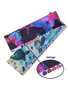
When analyzing a difficult (or any) fabric, a great place to look at is the selvedge.
Those little coloured dots can be helpful. While small, they do provide a look at the colours used in the fabric separately.
It can also be helpful to tape up your fabric and look at it from a distance. Now let’s dissect some fabric!
I find that using the colour wheel assists greatly in determining what colour group a fabric belongs to. Taking each fabric determine what the dominating colour(s) are. Here are a few examples:
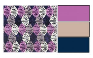 Example 1: Michalina by Fabric Creations
In this example, we can see that fabric is mainly made up of navy, purple, white, and taupe.
The dominating colours, navy, purple and taupe, are represented equally in the pattern. This makes it a judgement call!
Ideally this could be placed either with the navy or the purples, however in this case I would lean towards purple!
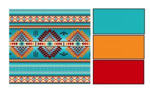 Example 2: Turquoise Stripe by Elizabeths Studio
This fabric has a lot of different colours.
It’s made up of 9 different shades turquoise/reds and yellows, I would tend to categorize this fabric as turquoise being the more prominent colour.
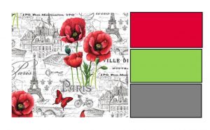
Example 3: Ooh La La by Northcott
This fabric is composed of greys/blacks and reds with green stem accents.
There appears to be more black/greys than reds, but the red stands out when this fabric is among other red fabrics. Because of this, you may categorize this fabric as red.
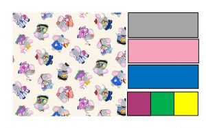 Example 4: Weekends by Erin McMorris
This fabric has tons of different colours.
Two shades of pink, two shades of blue, gray, ivory, yellow, purple, green, and white.
The dominating colours are pink and blue, but there are so many different colours that it can be categorized as multi-coloured.
In summary, the ultimate decision lies with you. Using your colour wheel as a guide will quickly help you determine whether your fabric belongs to a primary, secondary, or tertiary colour type.
Examples by “The Art of Choosing: Recognizing a Fabric’s Overall Color” by Jeni Baker who provides in depth colour analysis to help the modern day quilter!
Now it’s up to you to get started with Sorting, Sorting, and more Sorting!
Leave a Reply
You must be logged in to post a comment.