Quilt Colour Value
Creating great quilts starts with understanding Colour Value. This can be challenging for beginners, but it’s easier than you think.
Two things that have always delayed me with regards to quilting revolve around colour.
First, is my ability to focus. When I start looking at the fabrics that I would like to consider incorporating into a quilt, I am completely overwhelmed. There are so many styles and colours that I literally do not know where to start as my creative juices have literally short circuited. Talk about frustrating. And I am sure I am not alone.
Secondly, I have no idea what is going to look good. I may have a quilt pattern in my hand that says, “Use so many yards of this, that, and the other thing.” which spins me back into my ability to focus. Times like these I tend to walk away and try again another day when my senses are keener.
I know it all starts with understanding colour and colour value. So, as Picasso famously said, “Learn the rules like a pro, so you can break them like an artist.”
My goal is to give you a firm foundation in understanding how colour works, then provide tools, strategies, and practices for developing your “eye for colour”. This is how I have conquered this dilemma
This will take you from the “Hmmm… do these prints go together? Something seems a bit off, but I’m not quite sure what…” statements to approaching fabric selection with confidence, delight, and inspiration:
- Confidence in knowing what you’ve selected looks good because you understand colour theory and have trained your eye for colour harmony;
- Delight, pleasure, and enjoyment that comes from pulling together a great palette combination that makes you crave to get started; and
- Inspiration in trying new things and getting out of the colour ruts.
So, let’s study the basis of colour theory — the Colour Wheel.
Vocabulary:
- Value — Darkness or lightness of a colour
- Tint — made by adding white to a pure colour
- Shade — made by adding black to a pure colour
- Tone — made by adding gray to a pure colour
- Neutrals — black, white, gray, and sometimes brown and beige
Colour Types: – The Colour Wheel
A colour wheel is an essential part of any quilter’s toolbox. I use mine constantly when designing quilts or fabric collections. and when I am sorting my fabrics.
Terms You Will Hear When You Work with Colour Wheels
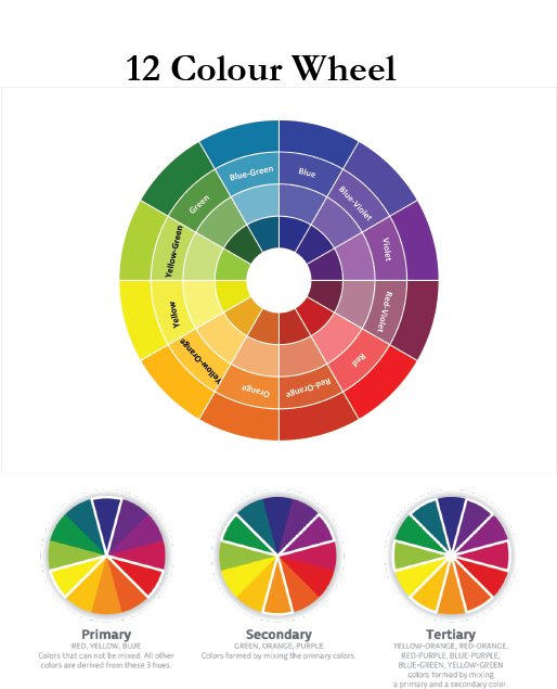
Primary Colours
Blue, red and yellow are all called primary colours because they are the basis for every other colour. Mix them together in different ways and you can create any colour on the colour wheel.
The three primary colours are arranged at equal distances from each other on the most commonly used simple colour wheel.
Secondary Colours
The three secondary colours are located midway between the primary colours. Secondary colours are created by mixing together equal amounts of the nearby primary colours. For example:
- Green is made from equal parts of blue and yellow
- Orange is made from equal parts of yellow and red
- Violet is made from equal parts of blue and red
What Are Tertiary Colours on the Colour Wheel?
Tertiary colours are created by combining equal parts of the primary and secondary colours that are closest to their sides: – For example:
- Yellow-green: mix equal parts of yellow and green
- Yellow-orange: mix equal parts of yellow and orange
- Red-orange: mix equal parts of orange and red
- Red-violet: mix equal parts of red and violet
- Blue-violet: mix equal parts of blue and violet
- Blue-green: mix equal parts of blue and green
Understanding the basic colours will help you get started in organizing your own fabric stash. Remember, it is always easier to sort your colours if they have been folded to the same sizes. Not only does this help in storage but also can be extremely rewarding when trying to create you quilt palette.
An upcoming blog will be regarding Tips on sorting Colours that you may find interesting. Stay tuned and remember to have fun because there really is no right or wrong in quilting!
Leave a Reply
You must be logged in to post a comment.