Quilt Colour Value – Part 2
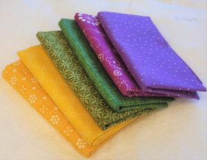
Quilting Fabrics
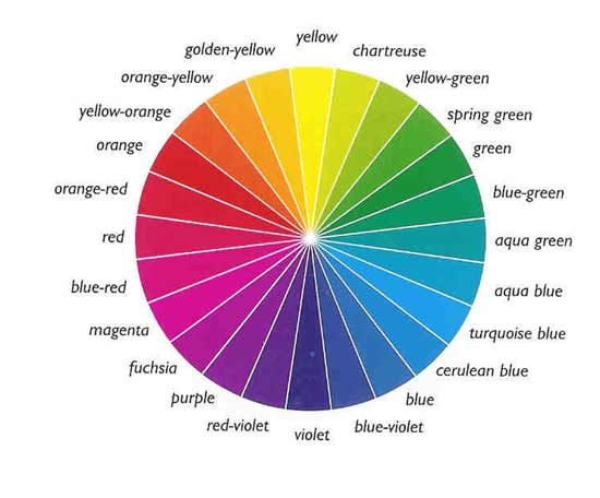
The type of colour wheel we are using displays pure colours, but most of the quilting fabrics you’ll use will most likely be altered versions of pure colours.
- Shades are created by adding varying amounts of black to a colour to make it darker.
- Tones are created when gray is added to colours, resulting in colours that are less intense versions of their pure versions.
- Tints are created by adding white to a pure colour to make it lighter.
What is Colour Dominance?
Dominant colours are the first colours we notice when we look at a quilt. Colour dominance in quilts is complex because it depends on the overall combination of fabric selections, but there are a few easy ways to predict how quilting fabrics will interact with each other.
Quilting Fabrics of Pure Colours
- Pure colours are more dominant in a design than toned colours containing gray.
- Yellow is the most dominant pure colour.
Warm Colours Pop out in a Quilt
- Warm colours, on the right of the colour wheel, are more dominant than the cool colours on the left side of the colour wheel.
Dark and Light Colours
Darker patches are often more noticeable than light patches, so they can be used to create contrast in a quilt, but colour warmth can step in and make the darks recede. For instance, which patch is most noticeable when placed side-by-side, a bright red or a black? It’s usually the red.
Experiment with your own fabrics to see which is most dominant. Using a design wall makes it simple to step back and view fabrics from a distance.
Extremely light fabrics used as random, infrequent accents often move forward in the design, making them more noticeable than dark fabrics. Traditional Amish quilters used that technique to add sparkle to their quilts.
Value (contrast) is just as important, and sometimes more important, than the colour itself.
Neutral Colours
- Neutrals are very weak colours that allow other colours to move forward in a design. Quilters often use neutrals for backgrounds or in other areas of the quilt they want to be less noticeable.
- Variations of gray and beige are considered neutral, and so is black when it acts as a backdrop for vibrant colours.
- Even though white is a neutral, stark white sometimes pops forward in the design.
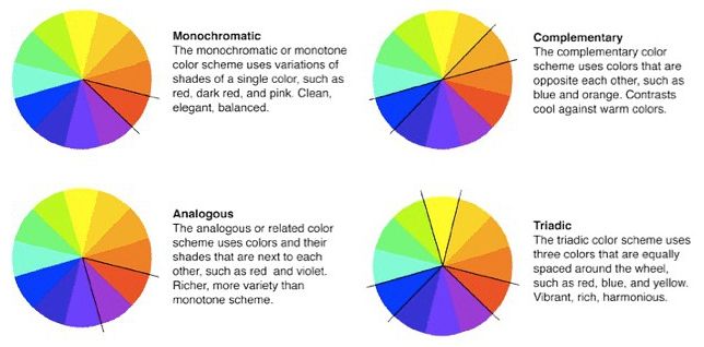
What Are Monochromatic Quilts?
Monochromatic quilts, or quilts made from just one family colour, needn’t be boring. Choose the colour you wish to work with first, and then add a variety of light, medium and dark values. By using different values of the colour, contrast will be added to the piece that is being created.
Add neutrals to the design to create a restful backdrop.
Contrast is important for most monochromatic quilts, so be sure to choose a range of fabrics in dark to light.
ontrast is important for most monochromatic quilts, so be sure to choose a range of fabrics in dark to light.
Hawaiian quilts are often monochromatic.
What Are Analogous Colours?
Analogous colours are three colours next to each other on the colour wheel, composed of one dominant colour (usually a primary or secondary colour), then a supporting colour (a secondary or tertiary colour), and a third colour that is either a mix of the two first colours, or an accent colour that pops. Analogous colours look good together naturally because their colour roots are similar.

To make an analogous quilt, select fabrics in a focal colour, and then choose fabrics from the two colours on each side of the focal. If you like, extend outward and add the next round of colours nearest to the focal colour. Try not to use equal amounts of the adjacent colours — mix it up.
Add depth and variety to analogous quilts by including neutrals, plus shades, tints. and tones of the colours used in the quilt.
What Are Complementary Colours?
Complementary colours are located across from each other on the colour wheel. Examples of complementary colours are:
- Red and green
- Red-violet and yellow-green
- Red-orange and blue-green
- Yellow and purple
- Yellow-orange and blue-violet
- Blue and orange

It’s often best to use one complementary colour in smaller quantities than its partner. For instance, if you select yellow and purple, do not sew the quilt with equal amounts of the two colours. Instead, use one as a highlight, sprinkling it throughout the layout.
What Is a Split Complementary Theme?
A split complementary layout is made by selecting three colours that are side by side on the colour wheel and then adding the colour that lies directly across the colour wheel from the colour at the center of the trio.

More Ways to Choose Colours
Forget about all the rules you’ve heard about colours that do and do not match and go with your instincts.
Use the colour wheel, experiment with the basic colour schemes, then let your imagination take over. Try something new. Sometimes our “mistakes” turn out to be our best successes.
Leave a Reply
You must be logged in to post a comment.